So I was talking with a friend a while ago, someone who is actually in the process of writing a book himself, and the topic of marketing came up. Then, somewhere along the way, the sub-subject of my original book cover came up. And then my friend shared with me something that slapped me in the face:
"Your book rocks. I’m going to be honest; your cover sucks."
After a few seconds of blustery indignation, I was struck with thunderous clarity. The first cover...the black tree in front of a blazing orange sky...I chose it because it was symbolically appropriate to the story. I filled it with value for MYSELF because I knew the story...I knew what it represented, and so it was meaningful to me. However, my friend’s comment woke me up and gave me a hard look at the artistically ambivalent world of book marketing (or marketing in general, really). He nailed it. My cover DID suck. Hard.
People who hadn’t read the book didn’t know squat about it like I did. They had no preexisting passion for it to fuel them, no idea what the story was or how the image on the cover related to it. All they probably saw was a boring black tree and a kind-of pretty orange sky. There was nothing to get excited about. The cover said "Hey, this is a book about a tree and something to do with Cain and some other stuff". With a limp period...not an exclamation point. Who would be interested in a book like THAT?
I needed a new cover. A new face for the book. So I downloaded a free equivalent of photoshop (because I’m cheap), and proceeded to search for images that would match up to a new vision I had. I got really lucky, found some that worked perfectly, and purchased the licenses (because I’m not THAT cheap). A few "how-to" youtube videos later, and voila...the new cover emerged:
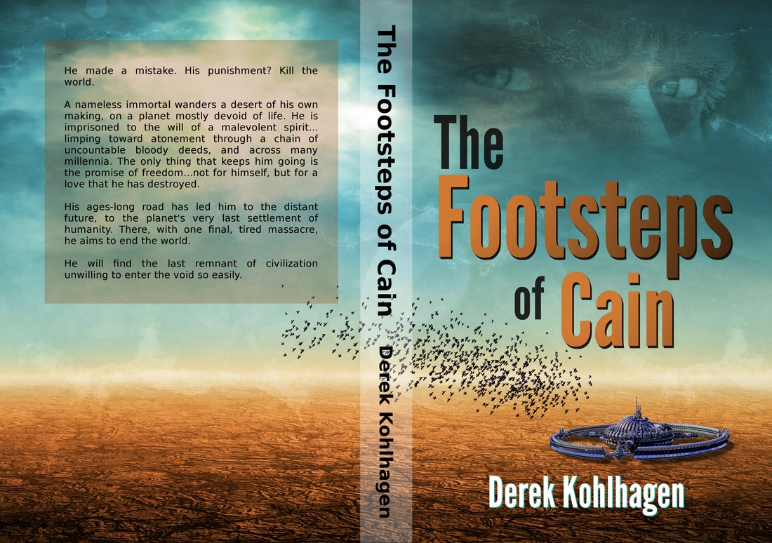
I’m proud of it...probably more than I’m supposed to say without sounding full of myself. But seriously you guys...I’m REALLY, REALLY proud of it. (Like, REALLY.) In my opinion, it does a much better job of putting key elements of the story in the reader’s face before they even crack the book, and hopefully shaking up their interest a little more.
So yeah, I’m psyched. Now I can be proud of what’s wrapped around the OUTSIDE of the book as well as what’s INSIDE. I’ll call it a full package, now, and be satisfied.
Now I just have to sell this thing a little, and get to work on the next one. No problem...right?
So yeah, I’m psyched. Now I can be proud of what’s wrapped around the OUTSIDE of the book as well as what’s INSIDE. I’ll call it a full package, now, and be satisfied.
Now I just have to sell this thing a little, and get to work on the next one. No problem...right?
 RSS Feed